People love to window shop.
Think about the last time you walked into a technology store or car dealership. You probably picked up the latest iPhone, watched an action movie on a 90″ projection display, or ripped down the highway in a $75,000 coupe.
If you have been checking your “Goal Conversion” statistics on Google Analytics, you might notice that your online customers are doing the same thing. People just like to put things in their shopping cart and then leave.
Imagine now that as you were barreling down the interstate in that car, the world’s greatest salesperson was whispering sweet nothings into your ear.
You would be more likely to walk out with that product, even if it wasn’t the best purchase decision on your mind.
Use the following tips to create the best checkout page on your WordPress website.
TABLE OF CONTENTS
- Use a Landing Page template
- Continuous Communication
- Refunds and Terms
- Show them their payment options
- Reduce number of fields
- A/B Testing
- Build a checkout page using Simple Shop
Give them nowhere else to go
The first step in creating a checkout page is to create an environment that is difficult to leave.
We don’t mean to annoy the customer when we say this either. We simply want to provide a focused experience for the customer to think about their experience. Imagine when in a store, once you had compared and found your ideal television amongst the pack, everything around was removed, except for the television and the price tag.
Try creating a “Landing Page” template in PHP which removes the following elements:
- Header
- Navigation Bar
- Footer
- Primary Sidebar
When you give people an open door to exit or other options, you detach them from the product. With all of these elements removed, you create an easier environment for the customer to understand what value they are receiving in purchasing your product.
They can still click the back button. They can still exit the window.
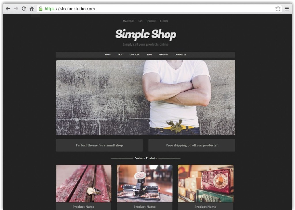
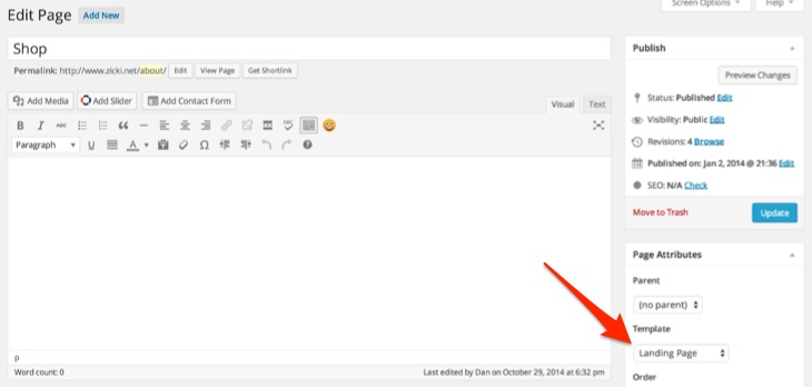
Alternatively, our Simple Shop WordPress theme comes with a “Landing Page” template option to select out of the box. This automatically removes the above mentioned elements from your Checkout page.
Use continuous checkout process communication
Following the same idea, you are going to want to make sure that your communication on the page is clear and consistent. Whether this be explaining what you get with your purchase on a floating sidebar or simply communicating the sales process down the checkout page.
There is nothing more frustrating to a customer than not understanding where to go next or why, especially when they are doing YOU a favor (purchasing your product).
While plugins like WooCommerce and Easy Digital Downloads have a good natural display of checkout items, you might improve them further with testimonials and reviews or other descriptive text about the products they purchase.
Try adding a sidebar which provides additional information about the purchase, like reinforcement as to who your company is and what you provide.
Refunds and terms on the checkout page
Along with reassurance of the quality of the product, you also want to provide financial reassurance. A terms page with a refund policy will go a long way to solidifying the credibility of your checkout process.
Create a “Terms” page on your WordPress website by creating a standard page and adding your textual content. To find out what legalese you will want to include, visit this link.
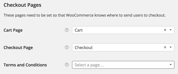
With most eCommerce plugins, there will be a section in the settings to enable the terms and conditions. In the case of WooCommerce, this is also the case. Under Settings > Checkout is an option to attach a terms and conditions page. Simply choose the “Terms” page from the dropdown and save.
On the subject of refunds
If you are in fact providing a refund policy in your terms, let us as the customer know!
Include an image directly on the checkout page to let the customer know that their purchase is totally secure and has a refund policy. Advertise the security to the customer.
Add card payment information to your website
People love feeling secure, and this is (mostly) in the visuals. Sure, you will need to make sure that you have SSL enabled on your website if you are going to take payment direct on the site.
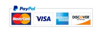
But whether you are using an offsite solution like PayPal Express or taking a credit card using a payment gateway like Stripe, it is a very good idea to let people know that their credit card information is safe and sound.
How do you do this? There are three ways.
1. List accepted payments and provide images
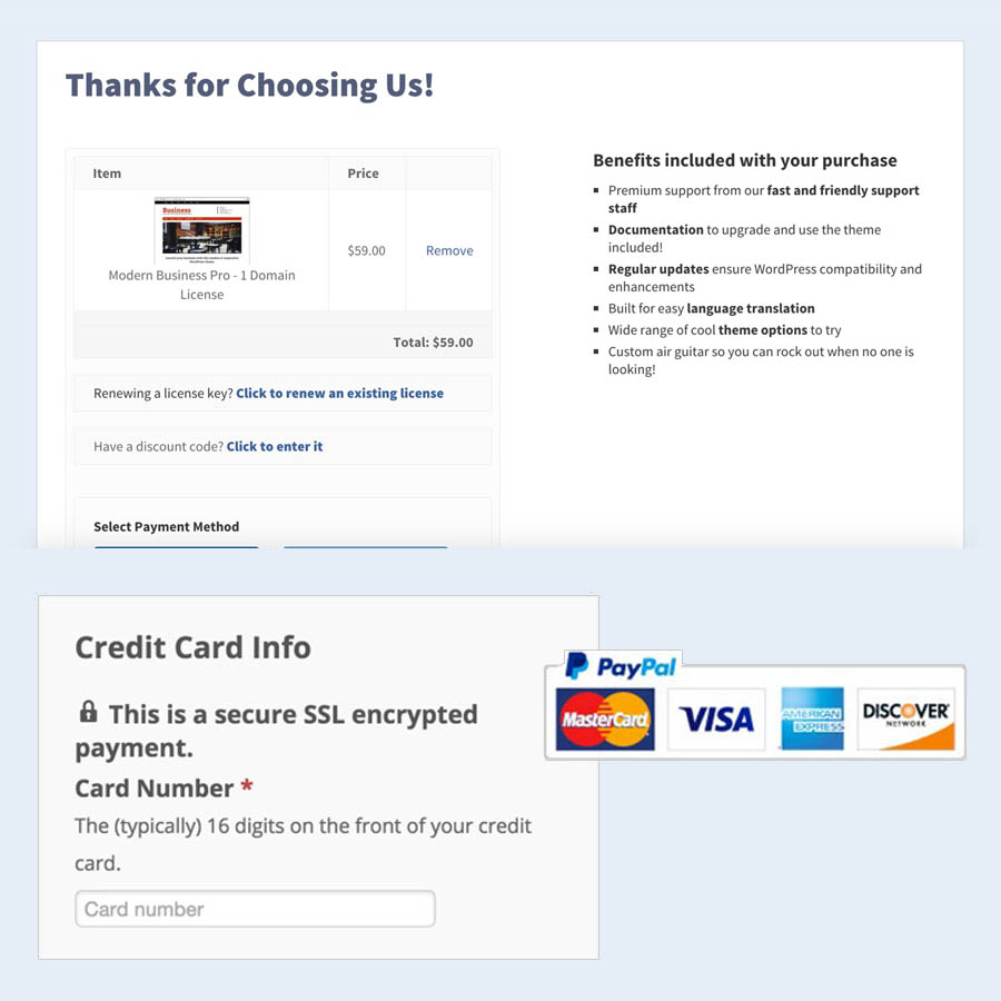
Like the image above shows, including visual information as to what cards and service you use to checkout provides familiarity in a customer purchase decision. Include images to show what payment gateways you offer, even if the text on the checkout page says it.
A little reinforcement never hurt anyone.
2. If you are using SSL, let people know
If your website supports checkout on site, you will need to get an SSL certificate for your website to accept credit information on the site.
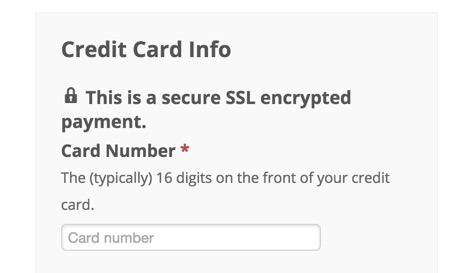
Near card entry or on the checkout page, have a small lock icon or other information to note that the purchase is secure.
3. Put all information in a off-color box
Question. Where are you most comfortable?
If you answered your house, bed, or car, then you are a perfect psychological example as to why styling credit card information in a separate box is good.
Along with text explaining that a purchase is secure, placing the fields for credit card entry also tells the mind that your purchase is secure, because it looks secure in the box. While this may sound ridiculous, it is a trick that works.
Reduce and optimize fields
Reducing the amount of inputs you have is always a great way to help increase conversions on your checkout page.
The less I have to do, the more likely I am to complete something.
There are plenty of opportunities to collect more information, like phone numbers, email addresses, opt-ins to newsletters, and more. But the more content you try to collect, the more difficult and confusing you will make the checkout process.
If you desperately need to collect other information (beyond billing/shipping information), you will want to try and do it separately or in other steps of the checkout process.
Where do my credit card fields go?
Additionally, checkout should be the last option that the user is given in the process. If you need to collect information about the user other than billing information, make sure it is collected BEFORE the checkout (if at all possible, on a separate page)
A/B Testing
Finally, to make the most out of your checkout page for the long haul, you will want to begin A/B testing and making smaller updates to your checkout page.
An example of an A/B test? Let’s say that your checkout information is in a grey box and you make the box darker. If you begin to see more sales completed from the checkout page after this change or less, you will know whether or not to keep the change or revert back.
A/B testing is a long and arduous process, but will help to increase sales. You will want a software to help track how people are interacting with your site before you go and make incremental changes.
Crazy Egg at checkout
A great software you can use to check how people navigate your page to determine what should be changed is Crazy Egg.

Crazy Egg will show you how far down a page users are scrolling, which areas of certain pages get more activity than others, and how many clicks different elements of a page are getting.
Here are some example insights you can get and work on after using Crazy Egg:
Problem: Most people don’t scroll beyond the fold of the checkout page.
Solution: Make it more enticing to scroll down the page with text about what you get or a value-add.
Problem: People are clicking on the icon of the site that you have
Solution: Add a float box window to the image of “Visa” to open up and explain what cards you accept and talk about SSL security.
Create WooCommerce Checkout Page on Simple Shop theme
Building all of this landing page technology can be a lot of work (there’s a whole article here dedicated to it!). If you want an easy solution to setting up a WooCommerce checkout page, look no further than the Simple Shop WordPress theme.
Simple Shop has a built in “Landing Page” template option to automatically hide all irrelevant content.
- Install and use Simple Shop as your WordPress theme
- Create a page called “Checkout” or whatever you would like the page to say for a title. In the content of the page, simply type [woocommerce_checkout]
- Navigate to the “Page Attributes” section and select Landing Page as the template. Publish the page.
- Go to WooCommerce > Settings > Checkout and set the checkout page to be the page you just created. Save your changes.
That’s it. With these steps, you now have a checkout page that is difficult to resist.
Simple Shop is also designed to work smoothly with WooCommerce and to display products and information in a smart way. Check it out and let us know your thoughts!
Have any questions or extra tips on checkout page design and development? Let us know in the comments below.
We hope that you enjoy our content. If you decide to make a purchase after clicking on one of our affiliate links, we’ll earn a small commission at no extra cost to you. Thanks for reading! View our Affiliate Disclosure


I appreciate when you include a table of contents for your longer “how to” articles. Makes it easier to absorb the information.
Absolutely Lisa, we agree!!